CSS Media Queries for standard Mobile Devices
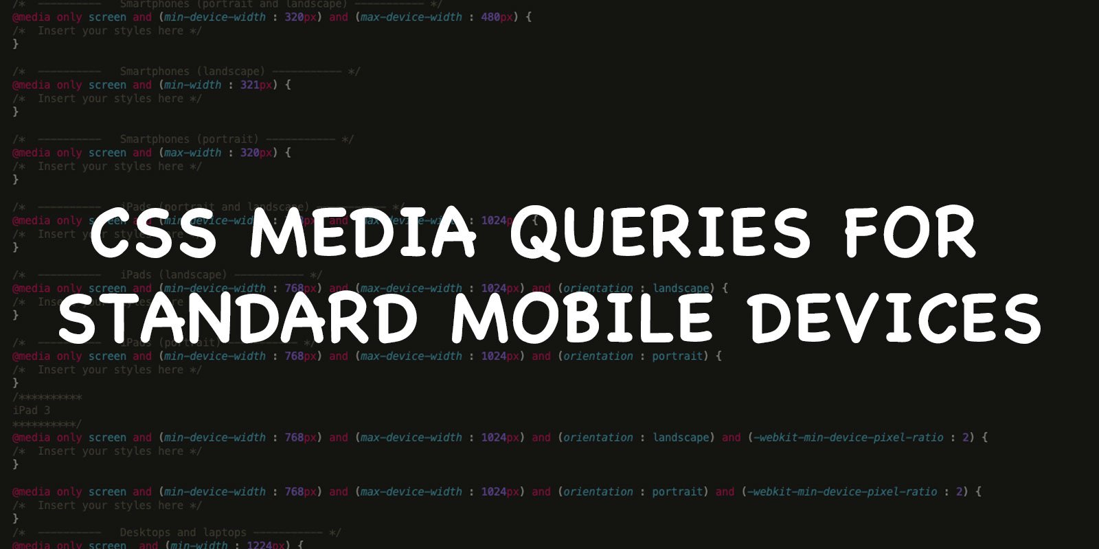
If you are creating a responsive website then you must have to use media queries to target different screen sizes like from large desktop screens to small mobile devices. In this article I will show you standard css media queries for mobile devices.
/*  ----------   Smartphones (portrait and landscape) ----------- */
@media only screen and (min-device-width : 320px) and (max-device-width : 480px) {
/*  Insert your styles here */
}

/*  ----------   Smartphones (landscape) ----------- */
@media only screen and (min-width : 321px) {
/*  Insert your styles here */
}

/*  ----------   Smartphones (portrait) ----------- */
@media only screen and (max-width : 320px) {
/*  Insert your styles here */
}

/*  ----------   iPads (portrait and landscape) ----------- */
@media only screen and (min-device-width : 768px) and (max-device-width : 1024px) {
/*  Insert your styles here */
}

/*  ----------   iPads (landscape) ----------- */
@media only screen and (min-device-width : 768px) and (max-device-width : 1024px) and (orientation : landscape) {
/*  Insert your styles here */
}

/*  ----------   iPads (portrait) ----------- */
@media only screen and (min-device-width : 768px) and (max-device-width : 1024px) and (orientation : portrait) {
/*  Insert your styles here */
}
/**********
iPad 3
**********/
@media only screen and (min-device-width : 768px) and (max-device-width : 1024px) and (orientation : landscape) and (-webkit-min-device-pixel-ratio : 2) {
/*  Insert your styles here */
}

@media only screen and (min-device-width : 768px) and (max-device-width : 1024px) and (orientation : portrait) and (-webkit-min-device-pixel-ratio : 2) {
/*  Insert your styles here */
}
/*  ----------   Desktops and laptops ----------- */
@media only screen  and (min-width : 1224px) {
/*  Insert your styles here */
}

/*  ----------   Large screens ----------- */
@media only screen  and (min-width : 1824px) {
/*  Insert your styles here */
}

/*  ----------   iPhone 4 ----------- */
@media only screen and (min-device-width : 320px) and (max-device-width : 480px) and (orientation : landscape) and (-webkit-min-device-pixel-ratio : 2) {
/*  Insert your styles here */
}

@media only screen and (min-device-width : 320px) and (max-device-width : 480px) and (orientation : portrait) and (-webkit-min-device-pixel-ratio : 2) {
/*  Insert your styles here */
}

/*  ----------   iPhone 5 ----------- */
@media only screen and (min-device-width: 320px) and (max-device-height: 568px) and (orientation : landscape) and (-webkit-device-pixel-ratio: 2){
/*  Insert your styles here */
}

@media only screen and (min-device-width: 320px) and (max-device-height: 568px) and (orientation : portrait) and (-webkit-device-pixel-ratio: 2){
/*  Insert your styles here */
}

/*  ----------   iPhone 6 ----------- */
@media only screen and (min-device-width: 375px) and (max-device-height: 667px) and (orientation : landscape) and (-webkit-device-pixel-ratio: 2){
/*  Insert your styles here */
}

@media only screen and (min-device-width: 375px) and (max-device-height: 667px) and (orientation : portrait) and (-webkit-device-pixel-ratio: 2){
/*  Insert your styles here */
}

/*  ----------   iPhone 6+ ----------- */
@media only screen and (min-device-width: 414px) and (max-device-height: 736px) and (orientation : landscape) and (-webkit-device-pixel-ratio: 2){
/*  Insert your styles here */
}

@media only screen and (min-device-width: 414px) and (max-device-height: 736px) and (orientation : portrait) and (-webkit-device-pixel-ratio: 2){
/*  Insert your styles here */
}

/*  ----------   Samsung Galaxy S3 ----------- */
@media only screen and (min-device-width: 320px) and (max-device-height: 640px) and (orientation : landscape) and (-webkit-device-pixel-ratio: 2){
/*  Insert your styles here */
}

@media only screen and (min-device-width: 320px) and (max-device-height: 640px) and (orientation : portrait) and (-webkit-device-pixel-ratio: 2){
/*  Insert your styles here */
}

/*  ----------   Samsung Galaxy S4 ----------- */
@media only screen and (min-device-width: 320px) and (max-device-height: 640px) and (orientation : landscape) and (-webkit-device-pixel-ratio: 3){
/*  Insert your styles here */
}

@media only screen and (min-device-width: 320px) and (max-device-height: 640px) and (orientation : portrait) and (-webkit-device-pixel-ratio: 3){
/*  Insert your styles here */
}

/*  ----------   Samsung Galaxy S5 ----------- */
@media only screen and (min-device-width: 360px) and (max-device-height: 640px) and (orientation : landscape) and (-webkit-device-pixel-ratio: 3){
/*  Insert your styles here */
}

@media only screen and (min-device-width: 360px) and (max-device-height: 640px) and (orientation : portrait) and (-webkit-device-pixel-ratio: 3){
/*  Insert your styles here */
}